Re-post from the ![]() blog
blog
Mobile-friendliness has been an important factor in Search Engine Optimization (SEO) for a while. Now, Google is rolling out an update that’ll make mobile websites even more important. It’s a significant change, and it could have a negative impact on your SEO if you’re unprepared.
Google’s new update is called the ‘mobile-first index’, and it’s true to its name. With this change, the search giant will prioritize your website’s mobile version on its result pages. In this article, we’re going to dig deeper into what Google’s mobile-first index is and what it means for you. We’ll then talk about how to prepare your WordPress website for this brave new world.
Let’s dig in!
What Google’s Mobile First-Index Is (And What It Means for You)

Google’s mobile-first index will reward responsive websites.
When you use Google to search for something, you will always see the same results whether you’re using a mobile device or a desktop computer. In the past, Google only used desktop versions of each website to determine its results, which lead to some issues. For instance, this meant that mobile users were served websites that weren’t mobile-friendly or featured less content than their desktop counterparts.
Due to the growing number of searches performed on mobile devices, Google is now rolling out an update called the mobile-first index. The main change is that Google will now index and rank websites by giving priority to their mobile versions. In other words, if your WordPress website provides a shoddy mobile experience, your SEO efforts will take a hit both on desktops and mobiles.
With that in mind, let’s break down how this update will affect you depending on what kind of site you have:
- Desktop-only website. Google will still rank and index your website, but you should expect to take a hit in the Search Engine Result Pages (SERPs).
- Both mobile and desktop versions. Your mobile website will take precedence now, which means you need to work on its SEO.
- Responsive website. You should be safe since your site is already optimized to provide an excellent mobile experience.
- AMP and non-AMP pages. If available, Google will prioritize the non-AMP mobile version of your website.
If you’re a WordPress user and you’re using a modern theme, you likely don’t need to worry. After all, many popular WordPress themes these days are responsive out of the box, so your website’s already provides an equal mobile and desktop experience. If you’re using an outdated theme or one that’s not responsive, then now is the time to consider a full redesign.
The real problem is if you’re serving two (or more) versions of your website depending on the type of device your visitors use. In that case, Google’s mobile-first index will most certainly have an impact on your site, unless you prepare for it.
How to Prepare Your WordPress Website for Google’s Mobile-First Index (4 Tips)
If your website isn’t fully responsive, this should be your primary goal. However, a full redesign often takes a lot of time, and in the meantime there are other things you can do to prepare for the rollout of Google’s mobile-first index.
Keep in mind – this section assumes you have a website with both mobile and desktop versions. If you only have a desktop version, you can skip ahead to tip number three.
1. Make Sure Your Website’s Mobile Version Includes All Your Key Content

Your mobile WordPress website should include all the same content as its desktop version.
If there are two versions of your website, they both need to feature the same content. Some site owners use stripped-down versions of their sites for mobile users instead of creating mobile-friendly versions with the same content. In the past, this might have been enough, but now you need your mobile website to be as fleshed out as its desktop counterpart.
To be more specific, both your mobile and desktop websites should contain all the same information and features. This is true even if their designs are different. This way, users will still be able to find your content after the rollout of Google’s mobile-first index.
If you’re using a separate WordPress installation to serve a mobile version of your website, you need to ensure it has all the same posts and pages as the desktop alternative. The best way to do this is by exporting your desktop content and importing it into your mobile installation.
2. Add the Same Metadata to All Versions of Your Website

Your post and page’s metadata should be the same on both mobile and desktop versions of your site.
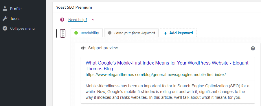
Aside from making sure both versions of your website share the same content, you also need to add identical metadata to all their pages. Metadata helps determine how search engines display your pages in the SERPs. Even if your mobile website shares the same content as the desktop version, but doesn’t have the same metadata, your SEO will still take a hit.
Metadata is essential to SEO since it enables you to have more control over your results. You’ve probably spent a lot of time working on your page and article’s meta descriptions, so you should make sure to include them on your mobile website.
The bad news is adding meta descriptions to your mobile content might take some time depending on how many pages your site contains. Even if you’re using an SEO plugin, you’ll still need to copy and paste each meta description into the right place manually. However, the effort is necessary since Google will be looking at your mobile site’s metadata first.
3. Continue to Focus on Website Performance

Website performance will still be important both for SEO and usability purposes.
One thing that’s not going to change with the mobile-first index is performance will still play a factor in your SEO. No one likes a slow website, whether it’s on mobile or desktop. More to the point, mobile devices sometimes have less stable connections, which makes website optimization even more critical.
Fortunately, there are a lot of ways you can make your WordPress website faster. Some quick examples include leveraging browser caching, using a Content Delivery Network (CDN), optimizing your images, and more. Fortunately for you, we’ve written extensively about WordPress optimization, so you should have no problem ensuring that your website runs fast.
4. Use a Mobile-Friendly Theme to Cut Your Work in Half

Using a mobile-friendly theme is the easiest way to create a responsive website.
The easiest thing you can do to make your WordPress website more mobile-friendly is to use a responsive theme. This means that when you design a page, the theme will automatically adapt it to smaller devices, so you only have to do the work once. Almost all major WordPress themes these days are built to support mobile devices with responsive designs.
If you’re not sure what theme to pick, here are a few tips to help you choose the right one:
- Make sure the theme’s description explicitly says it’s responsive.
- Look for themes that include preview functionality for different types of devices.
- Ideally, your theme should enable you to make small adjustments depending on the devices your visitors use.
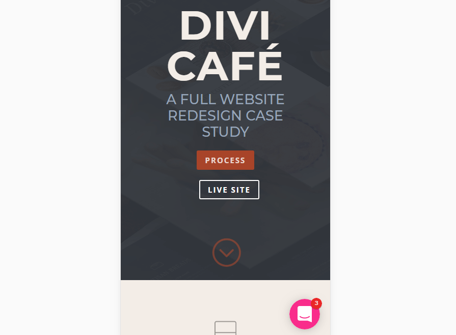
One theme that fits the bill for all three criteria is Divi. Few themes provide so much control over the way your website looks on a mobile device. It’s also easy to pick up even if you don’t have much experience with WordPress. This will make it lot easier to ensure that your site provides a great mobile experience.
Conclusion
Mobile traffic has been on the rise for a long time and that trend isn’t likely to reverse anytime soon. Google’s mobile-first index is another confirmation that for mobile is king, which means that you need to make sure your site is adapted to the new standard.
In this article, we’ve discussed some ways you can ensure this update doesn’t affect your site’s SEO negatively. These include:
- Make sure your website’s mobile version includes the same content.
- Add the same metadata to all versions of your website.
- Continue to focus on website performance.
- Use a mobile-friendly theme if you want to save yourself some headaches.
