Responsive web design was first introduced to us by Ethan Marcotte in a 2010 post published on A List Apart entitled (as you might expect) Responsive Web Design.
In the very same year – in fact, just a few weeks earlier – the iPad became the first of the current wave of mobile tablet devices to be released to the public, changing the way we surf the web and communicate with each other forever.
Since then, responsive design has slowly become more widespread.
But for the vast majority of people using the web, the term means nothing. They just want websites to render properly on their device. They don’t want to click on tiny hyperlinks that may or may not take them to the page they wanted, and they certainly don’t want to wait while a page rammed with resource-heavy code and imagery takes way too long to download.
They want zippy, fast-loading pages that are easy to use, which is what you should get from responsive design.
And that, in a nutshell, is why you’re reading this. In this post we’re going to help you turn the should into will.
Mobile Responsiveness is Now a Ranking Factor
What’s brought everything to a head is Google’s announcement several months ago that the user-friendliness of sites on mobile devices will become a ranking factor.
Google made the announcement in February:
Starting April 21, we will be expanding our use of mobile-friendliness as a ranking signal. This change will affect mobile searches in all languages worldwide and will have a significant impact in our search results. Consequently, users will find it easier to get relevant, high quality search results that are optimized for their devices.
Despite this, April 21 came and went, and nothing much really happened. At least notyet. But you can guarantee that it’s only a matter of time.
The update is dubbed Mobilegeddon in SEO and online marketing circles. It’s also a big deal for businesses; in fact, it’s such an important update that it made the news in the US and the UK.
In today’s post I want to look at ways you can test your site – or your clients’ – to see if they’re effectively mobile responsive or not. And if they’re not, we’ll cover what you can do about it.
What Is Good Responsive Design?
Quite simply, the goal of responsive design is to provide every user, no matter what device they’re using, with a consistently usable browsing experience.
In more specific terms, this means that all functions should work and behave the same way on each device. On your typical blog this could be everything from social sharing buttons, to mailing list sign-up forms, to navigation menus. Furthermore, content should be easily digestible, no matter what device the end user is browsing on.
Typically, there are four screen types:
- desktop,
- laptop,
- tablet, and
- smartphone.
The exact dimensions for each varies wildly across manufacturers. Your site should look the same on each variant. Figuring that out sounds like fun, right?
Do You Need a Responsive Website?
Quick answer: You certainly will do in the future. There’s no doubt at that. But do you need one now? Another quick answer: Almost certainly.
If you don’t spend much time looking at the data in Google Analytics, it’s a good time to remedy that – especially with regards to people visiting your site on a mobile device. From the data you can find out how many people visit your site using a mobile device. You can also discover how long they stick around and what kind of experience they’re having.
Depending upon how you’ve setup Analytics, you can also discover how many people using a mobile device convert to customers, join your mailing list or sign up for a free trial of your service or software.
To view the data, login to your Google Analytics account, select the site you want to review and navigate to Audience > Mobile > Overview.
Here you will see analytics for desktops, mobiles and tablets.
If your site is non-responsive, check out the data relating to how people interact with your site:
- Bounce Rate
- Pages/Session
- Avg Session Duration
- Goal Conversion Rate
If the numbers are significantly lower than the desktop stats, you have a serious issue on your hands. The data is telling you the people on mobiles and tablets are not having a good experience when they visit your site.
Which means that it’s time to do something.
Testing Your Site for Mobile Responsiveness
If you’re not that your site is mobile responsive, the first thing you must do is run a few tests. Thankfully, there are a lot of tools online that can help you to assess how a site looks and works on mobile devices.
We’ll come to some of those in a few seconds. But for now though, let’s perform the simplest tests of all.
If you’re on a desktop machine, go to the site you want to test, let it load, then make your browser screen narrower. As you do this, if the site has a responsive design, the elements from the web page will collapse down on top of each other, but you will still be able to see the whole page by virtue of scrolling.
If you’re using a mobile device, simply visit the site you want to test and see how it renders on your machine. If it looks like exactly the same as the desktop version but shrunk down, your site is not responsive.
How to Test Multiple Devices Using Online Emulators
It’s all very well running these two simple tests, but what about the plethora of machines out there? From iPads to Google Nexus’ to Samsung Galaxy smartphones? How does your site look on these?
Luckily, you don’t have to go out and spend a small fortune on every device on the market. Instead, use one of the emulator sites available to run your tests.
Let’s take a look at some of them.
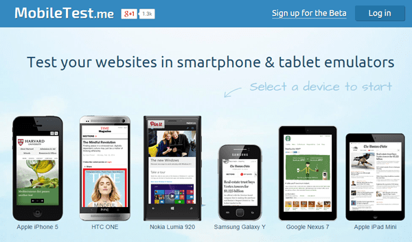
MobileTest.me

This one tests your site across six popular mobile device emulators, including the iPhone 5, HTC ONE and Google Nexus.
To test a site, click on the device you’re interested in and enter the URL of the site/page you want to test. Within a few seconds the emulator retrieves the page on the device. Not only that, the page links and other data remains active, so you can browse the site via the emulator.
Responsinator

A nifty emulator that mostly focuses mainly on Apple devices, but also includes a couple of Android machines. Instead of having to test each device in turn, like the MobileTest.me, you just enter the test URL and scroll down the page.
As you do, you’ll see how it looks on popular devices in both portrait and landscape mode.
Am I Responsive

Same process here: enter the test URL to get the results. This time, you don’t scroll; you’ll see the results at the top of the screen for generic devices. If you click inside the screen of each one, you can scroll and use the site as normal.
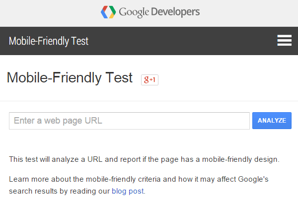
Google’s Mobile Friendly Test
There’s one more worth mentioning: Google’s own tool.

Use Google’s Mobile-Friendly Test.
What Next?
By this time you have an understanding of the importance of responsive design and know what your site looks like across multiple devices. But do you need to take action?
If your site works across all devices, you don’t need to do anything; just keep on working on improving your site for your current and future visitors.
If your site doesn’t work, you have three options:
- Convert the current design to responsive. This could well be more trouble than its worth.
- Use a mobile theme. This defeats the key responsive design principles of consistency and usability.
- Adopt a fresh mobile-responsive theme or design. While not the cheapest option, starting from scratch is arguably the only option that doesn’t represent a compromise of some kind.
Incidentally, it would be remiss of me not to mention that we make beautiful responsive themes, with no less than 21 to choose from.
Once you have the new theme installed, it’s time to test it. Here are three key considerations to bear in mind:
- Is it easy for users to navigate your site?
- Is the content easy to read?
- Is it easy for users to follow your Calls to Action?
Go through every part of your site as if you’re a user and fix any problems you find. If you’re using one of our themes and have come across an issue, just get in touch; we’d be happy to help.
Wrapping Up
I think the move by Google to ‘force’ people to adopt mobile responsive designs is long overdue.
For too, long large sites and big businesses have dragged their heels when it comes to switching. This potential loss in traffic and sales is a surefire signal for them to take action.
For freelance web designers and theme builders, you could be entering the busiest time of your career as the rush to comply gathers pace. How many clients do you have who are still using non-responsive designs? How many non-responsive sites are out there waiting for an update? I shudder to think! But one thing’s for sure: there’s plenty of business to be had, especially if you can clearly communicate just how important responsive design is.
If you need to ram the point home to your clients about the importance of responsive design and how their site looks compared to their competitors, the online emulators are great tools to use, and they should make selling your services a lot easier!
Article By:
![]()
By Tom Ewer
Tom Ewer is a professional writer, blogger and longtime WordPress enthusiast. He’s written over 1,000 articles across the web on the world’s most popular Content Management System, and has no intention of slowing down!

