Re-post from the ![]() blog
blog
You love your website. We get it. And why wouldn’t you? After all, you have put in hours and hours and sometimes quite a bit of money into bringing it into the world.
As a consequence, any insult hurled into its general direction is taken personally (and the perpetrator called a doo doo head – or worse). How dare they say bad things about your baby!?
However, I hate to break it to you, they might have a point. And in your heart of hearts, you know it, too. For weeks your bounce rate has been climbing, conversions are falling and your reputation dwindling. All the signs point to the need for a change.
Consider this an intervention. To open your eyes to the truth, in this article we will list all the things people hate about your website and that makes it hard to use, confusing, badly designed or simply out of date.
Ready to take of the rose-colored glasses and get to work on your website’s flaws? Then let’s go.
Here’s What Your Visitors Probably Hate About Your Site
Still here? Alright, now it’s too late to turn back. Let’s see if you recognize your site in the points below.
1. Your Site is Too Slow
People have never been as impatient as they are today. We want everything and we want it now. Especially on the web. I know you think that once people know how fantastic your site is, they will gladly wait for it to load. But that’s just not true.
47% of customers expect a site to load within two seconds. 40% will leave after three. Yes, one friggin’ second makes that much of a difference. In fact, Amazon found that one second delay in page loading would cost them $1.6 billion per year. That’s right, one second!
As a consequence, slow page loading times are one of the best ways to annoy the heck out of people (especially on mobile). It’s one of the things people most hate about websites. So much so that it will keep them from coming back.
Luckily, there is plenty of things you can do, from changing hosting providers and reducing the code to optimizing images and more. Even luckier, we have detailed article on this very topic.
2. It Doesn’t Look Good on Mobile Devices
Having a mobile optimized site is mandatory in today’s Internet. Nobody likes to use the old zoom-and-pan technique to consume your content. Neither do they like hitting the wrong menu items because your buttons are just too darn small.
Is there a quicker way to get people to rage quit your site? Probably not.
However, it’s not just human visitors. Search engines are just as annoyed of websites that fail to deliver an adequate mobile experience. In fact, Google goes so far as not even show websites in their mobile search results that they deem unfit to use with phones and tablet.
So, your existing users will quit your site while Google will stop sending you new ones. Sounds like a lose-lose situation to me. Time to stop being annoying and fix it already. This article will help you do so.
(By the way, a good step in the right direction is to use a mobile-optimized theme. Divi is one such example.)
3. It’s Littered With Popups
Popups can be a very effective tool for building an email list if used the right way. However, if not, they also have the potential to be the bane of your user’s existence and send your bounce rate soaring.
Nobody wants to close a welcome mat, normal popup and a slide-in form just to get to the content. If that is you, no wonder people are disgruntled with your site.
Keep in mind that there are other websites out there that don’t do the equivalent of yelling at their visitors. Plus, the back button is just a click away in every browser.
I’m not saying don’t use any pop-ups (you want to build an email list after all), I’m just saying be smart about it.
Take advantage of technology to stop showing returning visitors the same ads (especially if they have opted out before). Use exit intent to have to serve pop-ups only when they are about to leave or at least give them a time delay.
Or run A/B tests to find out which of your calls to action are actually effective and double down on that. Your visitors will thank you.
4. Your Website is Stuck in The 90s to Early 2000s
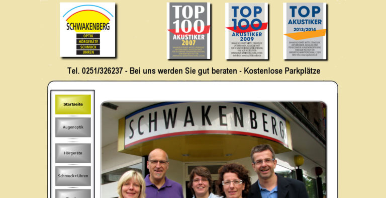
Look at the image below and tell me what’s wrong with it:

Hopefully, you can see it right away. The site looks like the person who built it learned web design on MySpace in 2004. Nice blast from the Internet archive, right?
However, don’t be the fooled. That is a website advertising an actual company and its services today! Of course, that is an extreme example and I don’t think your site looks like this. However, if it contains some of the design hallmarks of that same era, it’s time to rethink if you are not sending visitors away screaming.
Blinking GIFs, elaborate animations, flashing ads and other eyesores – just say no. They are distracting, annoying and in most cases not furthering your goal. If your site fits this description, you have found the explanation for the hate mail your receive.
5. Two Words: Stock Photos
Do you know this woman?

Image by Ariwasabi / shutterstock.com.
I see her literally everywhere. My wife and I actually have a running gag to point her out whenever we spot her. I have noticed her advertising everything from gyms to dentists to opticians.
That’s what happens when everyone uses the same stock images. Businesses (and websites) become indistinguishable from one another. A death sentence in marketing.
Plus, many of these images are cheesy, generic, non-genuine-looking and other unflattering adjectives.

Yeah, none of us actually work here. Image by Pressmaster / shutterstock.com.
Of course, you should use images in your content. And there are are exceptions (for example these).
However, stay away from stuff like above. It makes your company or website look as generic as the images.
A much better idea is to use unique images or stuff people can’t find elsewhere. For example, the Art of Manliness blog uses old vintage photos. Custom illustrations are another option. If that is not your thing, at least try to use real photos of your employees or clients.
6. Bad, Overly Optimized or Too Much Copy
Depending on how old you are, you might still remember the bad old times of SEO. Back in the day, when the motto was “the more keywords, the better”.
You would find pages with the same key phrases squeezed into every possible nook and cranny. Or copy that sounded as repetitive as the jokes in bad sitcoms.
Thankfully, search engines have caught on and punish people for said behavior. Yet, unfortunately, not everyone else has.
If you are one of those who still engage in keyword stuffing, it’s time to cut it out and get with the times. Read up some SEO copywriting tips, learn how to write in a way that is engaging and creates a connection instead of using marketing speak. And exchange your long prose with some multimedia! People only read 28% of your text anyway.
7. A Bland “About” Page
Especially if you are running a personal blog, the about page is usually one of the most frequented pages of a website. Visitors care about the person behind the writing and want to learn more about them.
However, this also contains the chance for failure. An impersonal about page filled with industry drivel that says nothing with a lot of words makes no emotional impact and puts people’s brains to sleep can quickly become one of the things people hate about your website.
To avoid this scenario, focus on language that people actually use, tell a story, connect. Also, make sure everything is up to date, including your contact information.
8. Your Site Structure is Non-existent
Little is as annoying as a badly structured website. People come to your website to accomplish a goal, not wander around like a labyrinth (unless they are minotaurs, who are pretty Internet averse).
Two of the most important factors for site structure is site navigation and internal linking. Get one of them or both of them wrong and your visitor’s annoyance level will show a sudden spike.
Consequently, when it comes to navigation, make sure you first map out the route you want your visitors to take. Only then can you create a proper way for them. After that, give them directions via headlines, copywriting, calls to action and a clearly labeled (and not overstuffed) navigation.
As for internal links, make sure to link between pages on your site that are topically related. The point is always to enhance the experience of the visitor, not run a smart SEO scheme. In the same vein, don’t overdo the anchor text!
And for heaven’s sake, check your site for broken links!
9. Your Titles and Headlines Suck
Titles, especially blog titles are an important part of copywriting. They are usually the thing that pulls people in – or pushes them away.
Page titles also create expectations. That’s a good thing if you can fulfill them, however, an equally bad one if you don’t.
Imagine you had read the headline of this post, expecting for the author to tear you into you about your website flaws and all I’d end up doing is mollycoddle you. That would be a shame, wouldn’t it?
The point is, don’t do the old bait-and-switch and stay away from click bait practices. It will only annoy people and send them the other way.
For tips on how to craft compelling titles and headlines, check this article.
10. Multimedia on Autoplay? You Gotta Be Kidding!

Who hasn’t had the experience of opening a bunch of tabs and suddenly having one of them play an unsolicited video or sound file in the background? And who here thought that was a good thing? Nobody. Especially in the office environment without headphones.
If your site does that, keep in mind that closing a tab is much faster than looking for the mute or stop button on your video. Whoops, there goes another visitor, never to return.
If you do have videos on your site (and there are good reasons to do so), make sure they are voluntary to play, not mandatory. Or, at least take a page out of Facebook’s playbook and play them on mute.
11. Two-site Syndrome
Even if you don’t know the term, chances are you have experienced two-site syndrome before. It’s when a company’s information website and e-commerce area are built with two different platforms.
For example, when you find yourself on a shop built with Shopify that takes you to a WordPress.com site when clicking on the blog button. It totally disrupts user experience and looks plain unprofessional. Say goodbye to your conversion rates!
The good thing is, with WordPress there is absolutely no reason for the divide. WooCommerce and other e-commerce plugins integrate seamlessly into the platform so you can have everything in one place.
What Things Do You Hate on Websites?
As parents of our web presences, we idealize them. We think they can do no wrong and there’s never been a better website out there.
For that reason, it’s often hard to fathom that others have a different opinion. Yet, your analytics might indicate just that.
The points above are frequent things people hate about your website and websites in general. If you recognize yourself in those points, for the sake of all of us, take some remedial action.
You will find that, even if your site changes a bit, you will still love it. Only this time others will share the sentiment.
