Thanks to the omnipresence of digital devices, everyone is becoming aware of the importance of digital typography. In the United States alone some 187 million peopleare using smartphones. By 2017 it is estimated that over a third of the world’s population will own one. 42% of that market share is held by Apple with their suite of iPhones and iPads. When it comes to e-readers, Amazon has well over 43 million Kindle devices in circulation.
This wouldn’t necessitate any revolution in the typography world, except that Amazon, Apple, and even Google have continued their habit of innovation by introducing their own custom typefaces as an attempt get the most out of the transforming technological scene.
1. Scripts
This is a perennial favorite that is going to receive even more favoritism in the years to come. Scripts are one of those traditional typefaces that have appeared in a variety of trendy reincarnations. Take a look at this killer landing page from Plated:
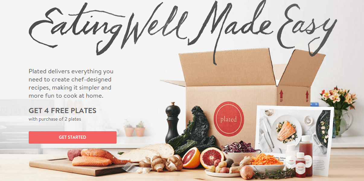
Source: Plated
Their familiarity and the natural feel allow script typefaces to escape the coldness, technical impression of the digital environment and achieve a more humanized look.
2. Watercolor
Watercolor is another style that can bring life to your digital canvas. Watercolor typeface gives the impression of a fun-loving and light-hearted attitude, so it is great when you want to emphasize a down-to-earth, personal approach behind a brand or service:
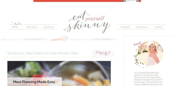
Source: Eat Yourself Skinny
And here’s another example, this time of watercolor with an attitude:
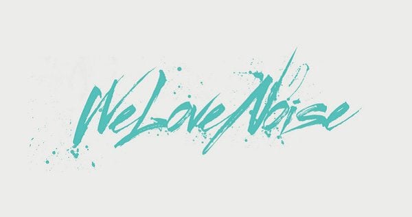
Source: We Love Noise
3. Really Big and Really Small
Font size is a means of controlling influence. By employing extremes, in isolation or right next to each, it becomes possible to convey a message powerfully without being obnoxious or obscure. You might see a single word that fills an entire screen, like this one from We Love Noise:
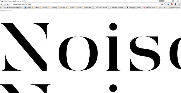
Source: We Love Noise
Or you can go the other direction in order to control points of focus and emphasis. Small words can speak loudly if presented in the right way:
Source: ThemeFisher
The smaller typeface usually calls for high contrast font colors with thick strokes. Combine this with a lot of surrounding negative space. Small typeface works very well with a hero-style image to highlight a product or value proposition:
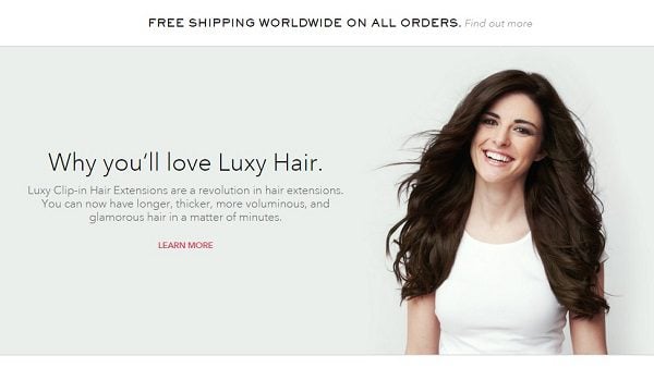
Source: Luxy Hair
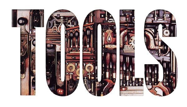
4. Hand-drawn Typeface
Looking for something distinctive? Hand-drawn typeface is on the rise as a powerful yet versatile option, allowing it to be incorporated into designs, illustrations, custom graphics, advertising copy, and signage. They aren’t all hand-drawn. Some are stock fonts modified to look hand-drawn. Either way, they add a personal touch.
Diet Coke used this typeface on a promotional page with Taylor Swift and it worked very well:
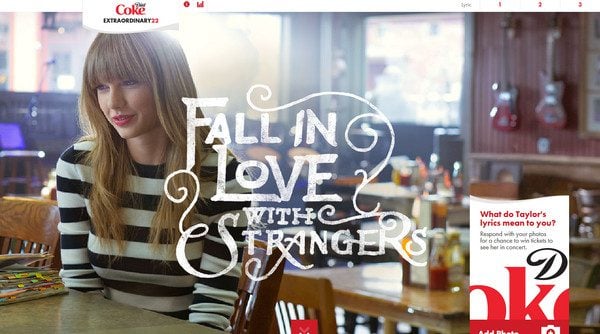
Source: Diet Coke
Among the list of typography trends, hand-drawn text is unique as it is capable of conveying subtle messaging about the organization behind it. Consequently, you probably won’t see too many hand-drawn fonts in the corporate world. But you will see them plenty in service industries:
Source: DesignModo
5. Photo Overlays
This is the one you see on social media every day, usually on inspirational memes involving a quote over some nature scene. As a web design technique, photo overlays owe some of the popularity to developments in CSS that make it easier to make this kind of text editable:
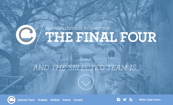
Source: Waller Creek Conservancy
Because you are dealing with a photo background, you should keep text minimalistic or risk visual confusion. As for the background, there shouldn’t be elements in the image that jump out at you and steal the focus from your text.
6. Geometric Design
It’s probably not accurate to say that geometric fonts are themselves on the rise, but they are certainly being swept up within other trends. Take Jova’s approach as an example of how a striking geometric type can be in the right context:
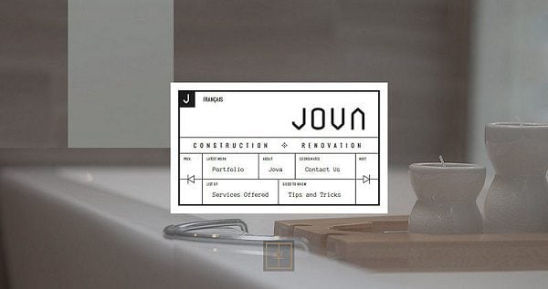
Source: Jova Construction
And then there’s this geometric text placed over an animated background, which is just plain cool:
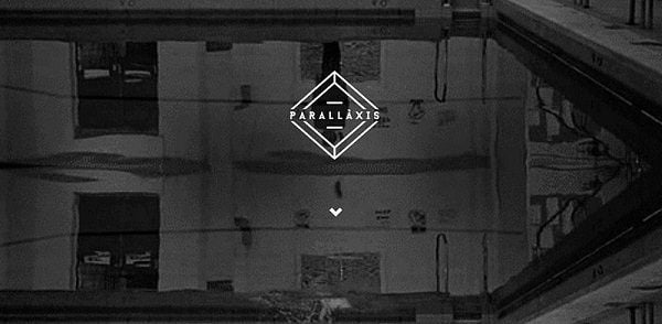
Source: Parallaxis
7. Serifs
With respect to popularity and sales, sans serifs tend to steal the spotlight. Many designers, however, are turning back to the good old-fashioned serif. It’s a typical example of one of those back to basics trends, and it works because serif fonts are elegant, readable, and clean.
Readers Digest chose the serif font after some A/B testing on their title design:
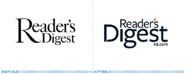
Source: Mequoda
8. Slab Serifs
A specific type of serif, the slab serif, is also catching on. Thanks to high resolution capabilities, slab serifs can suggest boldness without being overly bold, conveying practicality, stability, reliability. A good slab serif can act as a solid foundation for a landing page:
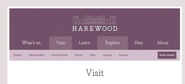
Source: Harewood House
9. Creative Use of the Simple
Sometimes creativity is all you need, and with typefaces this is no exception. Plenty of designers have taken the most basic fonts and made them memorable. The most obvious example of this approach is the text-over-image, which reverse the normal relationship between type and image:
Source: DePaul
Those word clouds you see popping up everywhere are another example of this creative turn. Just make sure that, if readability is the ultimate goal, the message isn’t lost in the beauty. Meaning is primary:
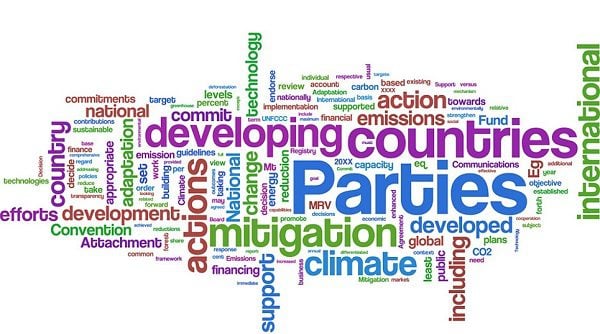
Source: The Guardian
10. Letterpress
Letterpress means one of two things:
Usually it refers to a typeface that has a subtle inset effect to make it appear pressed-in to a medium, hence its name:
Source: Denis Designs
Secondly, it can refer to a retro design style that you’ve certainly seen in last year’s typography trends in which various fonts are mixed and matched and fitted into a single justified column, as if the design were arranged on a press and stamped onto the page:
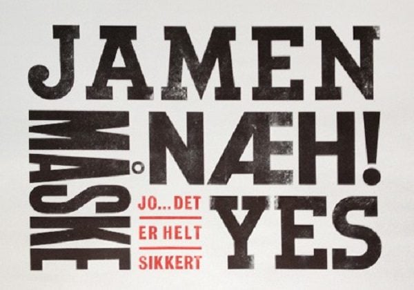
Source: Bureau of Betterment
11. Mixed and Matched
Mixed type means just a mix of types. Let’s say a minimum of three. This doesn’t just mean a variation on a single font, but a carefully matched set of very different fonts that play on each other’s idiosyncrasies to create an overall visual effect.
Balance is key to this approach, but when done right it can be very effective. Usually the fonts chosen for the mix take account of other textures, patterns and artwork that are going to be present in the design, playing off of these themes:
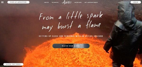
Source: Adventure
12. Retro
By now you know that retro is in. It has been always common in every art to look to the past for inspiration, but retro adds its own particular permutations to traditional typography trends. It gives the odd combination of nostalgia and futurism at the same time:
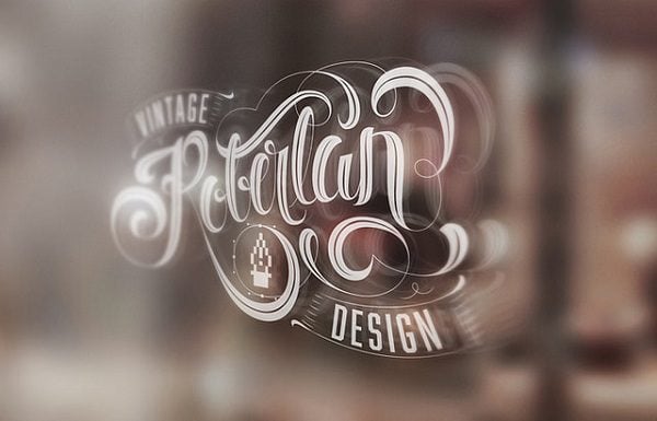
Source: Roberlan Borges
And if grunge is your thing, you are going to need retro:
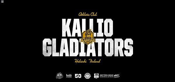
Source: Kallio Gladiators
13. Decorative Type
There are mixed feelings out there about decorative type, and with good reason. Decorative type has been used plenty often to commit crimes again design. On the other hand, some designers have come up with solid applications of the most extravagant typefaces.
They can be subtle, just barely stylized approaches, or they can be bold and highly contrasted in order to highlight quirkiness or emphasize originality. At any rate, decorative type is clearly in this year, as can be seen in most of the other trends on this list:
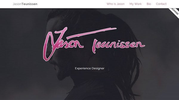
Source: Jason Teunissen
14. All Caps
Need to send your message loud and clear? Want to yell at your readers without sending them running? Then you need to learn how to pull off an all caps typography. It isn’t easy and you can go overboard real fast, but done well it can be bold and beautiful, like the background text on this lively landing page:
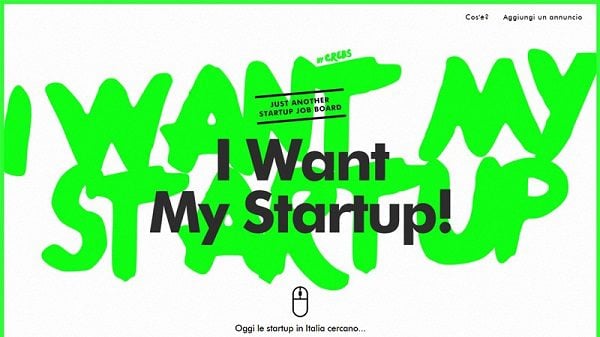
Source: I Want My Startup
15. Font Availability
Design trends can be influenced by supply and demand fluctuations, just like anything else. Since font availability is on the rise, designers have become equipped with larger arsenals at a lower cost. Or, in the case of Google Fonts, no cost at all:
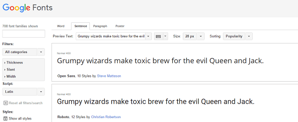
Source: Google
This is big for typography. In the past, designers may have had to be very selective with typefaces, taking budget concerns into account under the old maxim that beggars can’t be choosers. That is becoming less true as it becomes easier to customize typefaces.
16. Type Customization
Speaking of customization in typography, type design was once an activity reserved for the elite. Not so much anymore, it seems, as the rank-and-file graphic designers are finding themselves presented with tools and utilities that allow them to come up with their own variations on existing fonts, and even embark on their own custom creations. The tools can be as simple as the Glyphs app which provides an entry-level set of production tools to empower beginners:
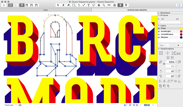
Source: Glyphs
And then there is Adobe’s Project Faces, and others such as Prototypo and FontArk. Obviously these tools alone aren’t going to produce an expert-level typeface, but they will certainly increase the range of possibilities for the average designer.
17. Responsive Typography
With the vast market penetration of mobile devices and the fact that marketing today needs to remain appealing in various shapes and sizes, responsive typography is becoming a necessity. This basically means that typefaces must be capable of shrinking or expanding depending on the size of screen the viewer is using.
Although responsive typography may seem like a technical problem, it is an artistic challenge as well because the designer has to keep in mind all the different arrangements a layout might assume.
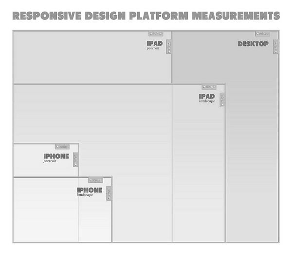
Source: Flickr
18. Dramatic Type
Forget utilitarian. Sometimes your typeface needs to convey feeling as much as meaning, and for that function more designers are turning to dramatic typography. Dramatic typefaces stands out. Think sans serif fonts that reach through the computer screen and demand the reader’s attention and direct it toward points of emphasis:
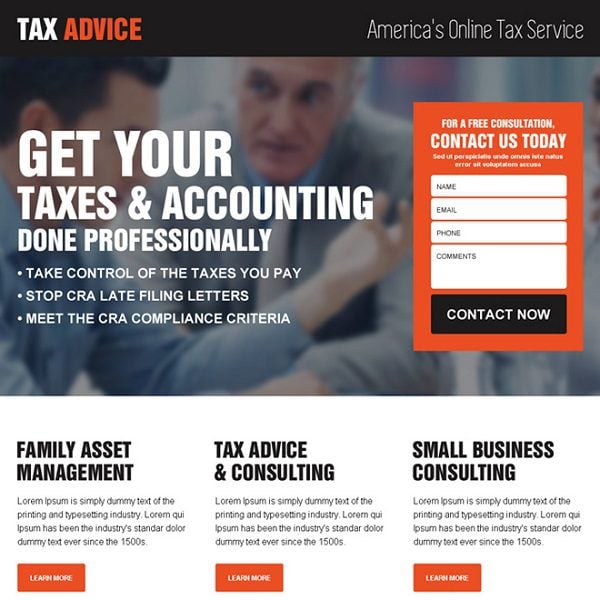
Source: RLPD
19. Flat Design
Flat designs tend to be user-centric, in the sense that they focus on utility and therefore make a great approach to app UI design. They don’t depend on bright color, but on a reserved readability and clarity. Take a look at this minimalistic weather app:
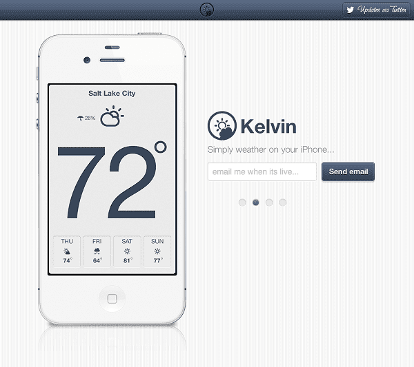
Source: CreativeBloq
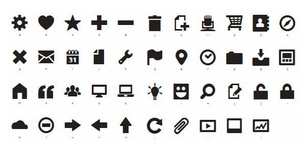
20. Icon Fonts
Icon fonts as a trend? You bet, and it makes total sense. Icon fonts can be very useful as a means of coming up with a comprehensive range of icons that have a consistent feel. And because they are scalable vectors they are responsive enough to adapt to high resolutions and various screen sizes.
Source: NetDNA
Typography Renaissance 2016
It’s important that you don’t jump into any one trend too far. Keeping your personal identity and a sense of moderation always at the forefront is key to a healthy appreciation of novelty and innovation. But regardless of where you take them and how many you choose to incorporate into your arsenal, these typography trends suggest that there are some exciting things afoot.
The growth in typographic sensitivity could mean a new renaissance for designers. It could bring with it a more demanding audience and greater expectations for well-executed typefaces. This in turn could mean a new wave of typography evolution and artistry. The trends listed here are only the beginning of the story.